Typography
After a long side-track from this project, I'm finally back on it (nearly) full time. I'd written most of this post last year but got tied up in other things before I could upload it. Mostly untied now.
Playdate Standards
Panic, maker of Playdate, is a long-running Mac-focused software developer, which somehow means they're generally pretty sharp when it comes to design, especially typographical design. The Playdate is no exception and if you notice these sorts of things, you might agree that the built-in system fonts and overall typography look great.
I started this project, like any other, using way too many font faces and sizes throughout every part of the game. This was in noticeable contrast to the refined typography in Playdate's menus and all the other games I've seen so far for the system.
A logical solution would've been to just pick one style-appropriate font and stick with it so obviously that's not what I've done. Instead, I decided to ditch bitmap-based fonts altogether and make a custom line-based font rendering system instead.
Vector Font
A vector font is just a bunch of lines for each character, surely not too hard to create. To do this, maybe I should use a specialized font editing program? Well yes, there are plenty of nice font glyph editing tools out there. You may be surprised to find that they each cost, on average, approximately one billion dollars. Or if they're free/cheap then they're both old and hard to use. A deadly combo.
Since I'm targetting a limited type of font -- lines only, no filled shapes -- just about any svg-editing program would work. Illustrator's my go-to tool for vector stuff so that's what I'm using here to author the font paths. Expensive but already in my toolbox.
I'm designing the font in a single svg with the grid enabled. One reference square defines the glyph cell size and origin and from there, each glyph is in its own group, named for the character it represents.
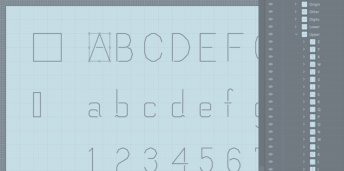
Editing character paths in Illustrator
To get this into the game, the svg file is processed directly by a python build script to extract the paths and format them into Lua source code. Avoiding the trouble of a File->Export step is a central goal for me on this game and so far it's been a surprising revelation for my productivity to have this seemingly small convenience.
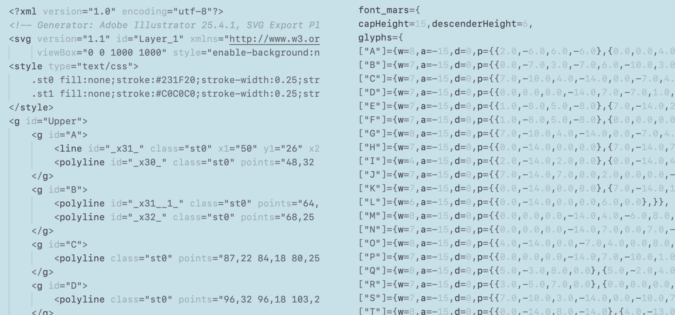
SVG converted to Lua data structures
There are a few svg-reader modules for python but I found my simple needs well-handled by just parsing the xml file directly. As long as I don't use any fancy svg features, the format is easy enough to work out.
On the game side, the font data comes in directly as sets of lines for each glyph. Strings of text are converted to lists of glyphs, wordwrapped, and stored in a simple point list format that's quick to draw.
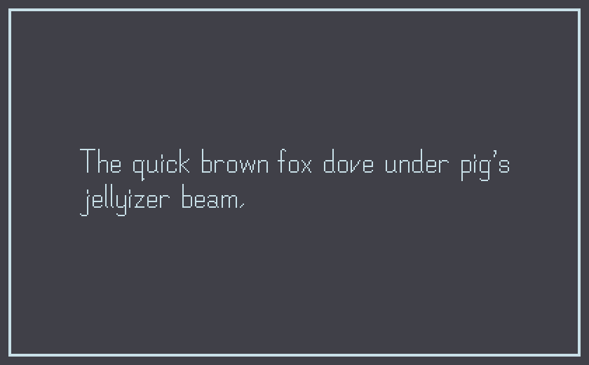
First try at a vector font
Looks fine, but compared to one of the fonts available in the Playdate SDK it feels to me like a poor version of a well-crafted bitmapped font.
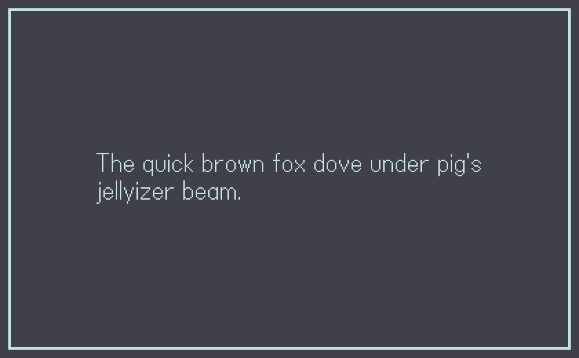
Playdate's built-in "Asheville" bitmap font. Very nice.
There is some upside to what I'm doing here though. Because it's being drawn as lines and not bitmaps, the point data can be scaled trivially and the line-width can be adjusted for a basic bolding effect.
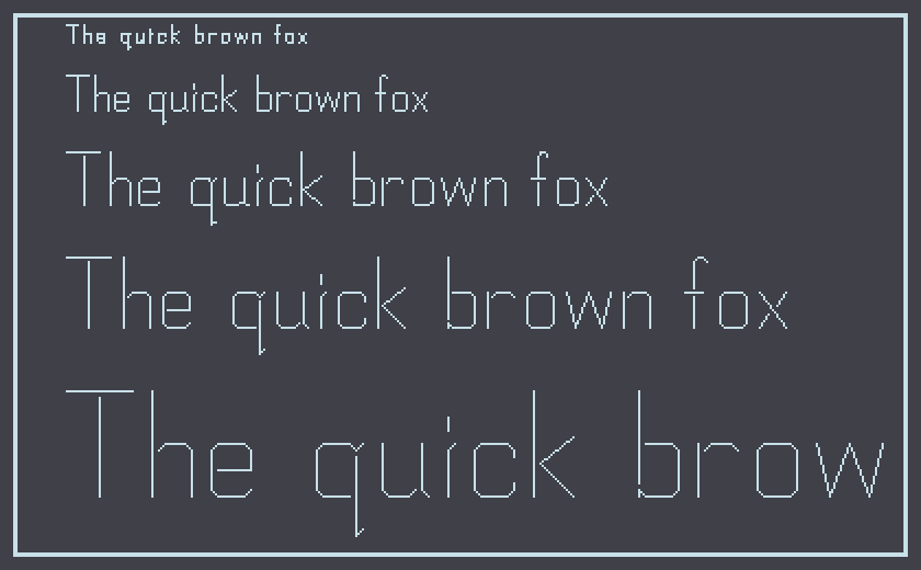
Scaling the points
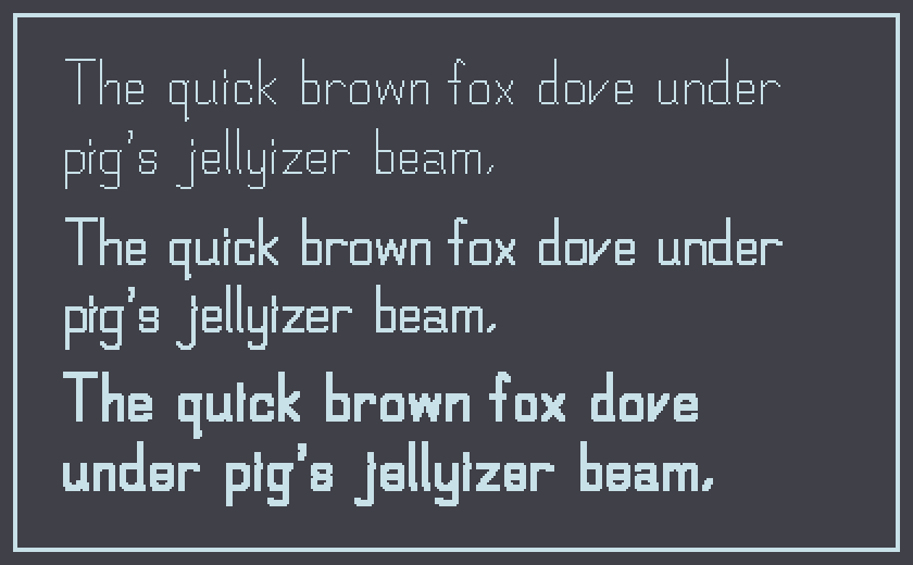
Drawing with different line thicknesses. 3 pixels is a bit much.
After getting a handle on what was possible I leaned into the technique and designed a much more vectory-font. Something to stylistically justify using lines instead of bitmaps.
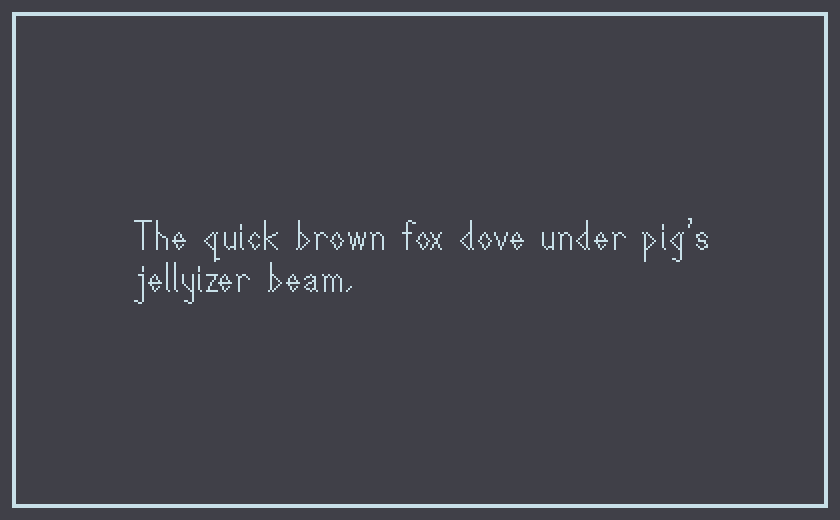
Leaning into the vector-ness
And why settle for boring, static, easy-to-read text? Or confine ourselves to the rigid frame of cardinal alignment?
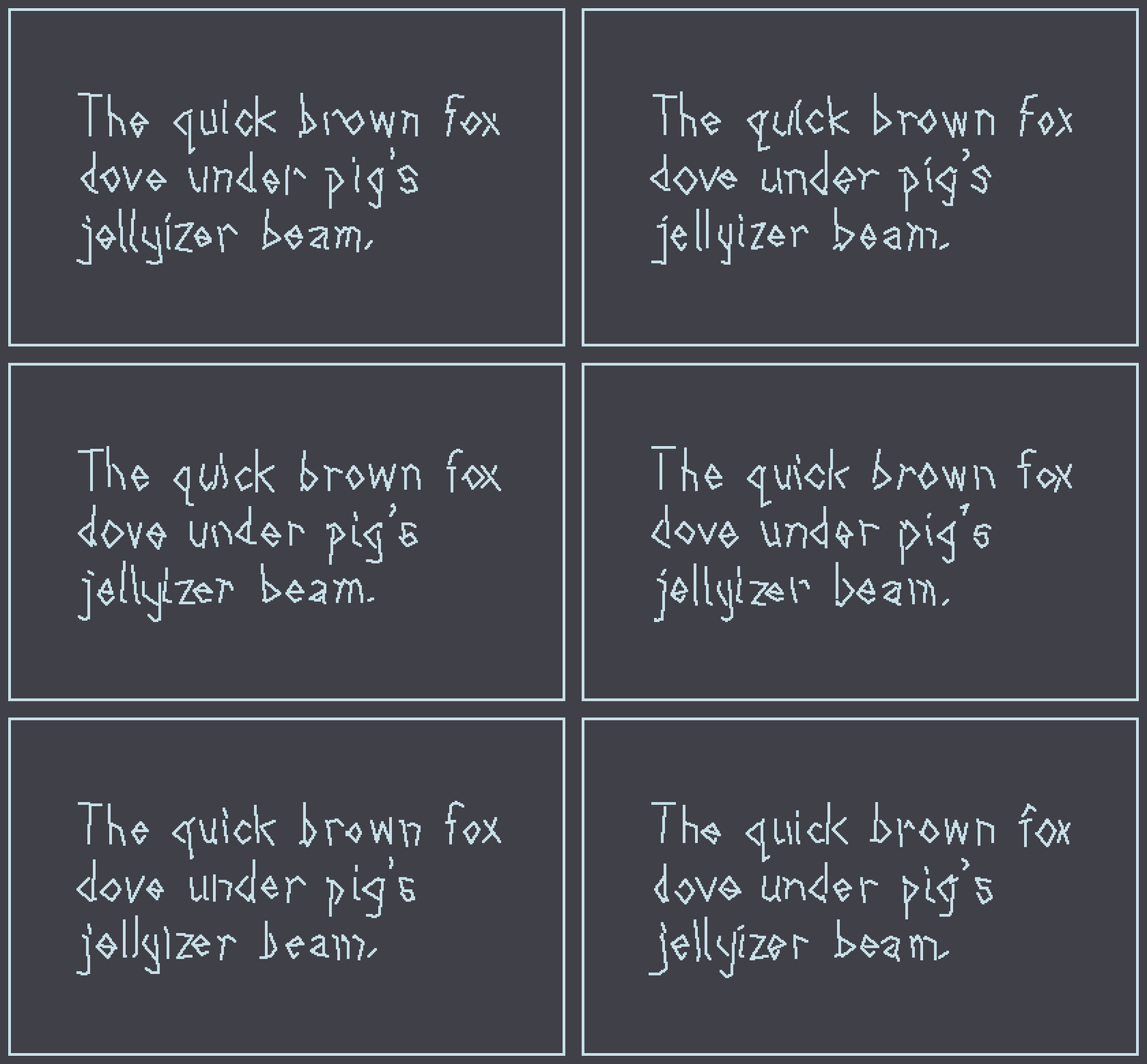
Wigglin'
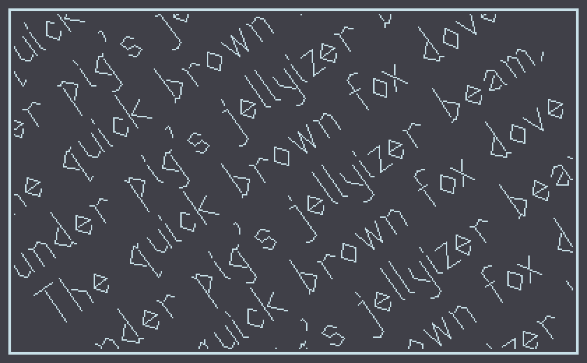
Rotatin'
Restraint Guaranteed
So now I have one font throughout the game. Lots of different sizes and bold settings though, so some restraint can still be discarded.
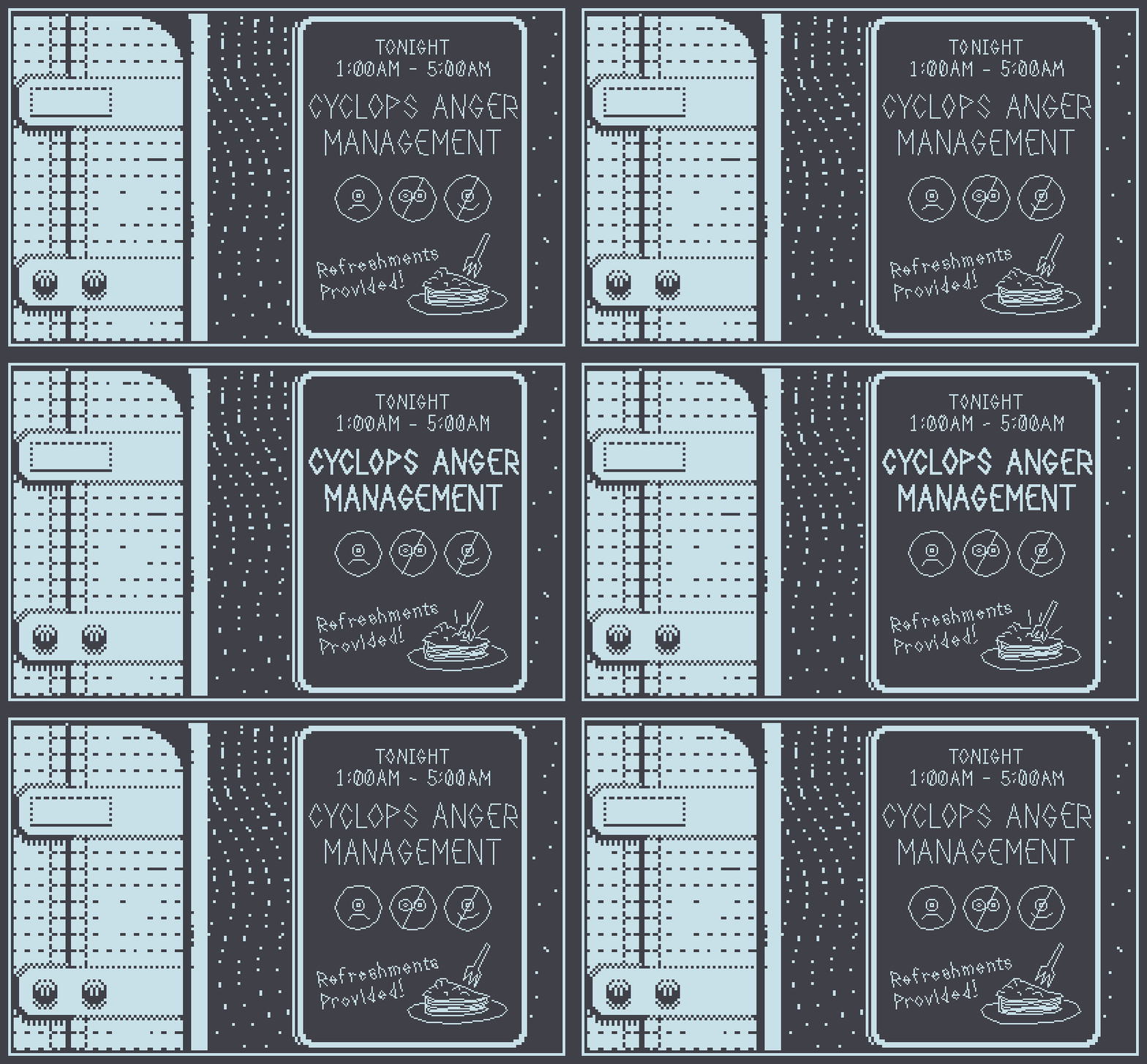
Working with unfilled vectors here has made me interested in doing a whole project with them. Too late for this game but maybe in the future.
Mars After Midnight
On Mars, after midnight, at the off-colony community support center. For Playdate.
| Status | In development |
| Author | dukope |
More posts
- Synthesizing Martian SpeechJan 12, 2024
- Face Generator UpdatesMay 19, 2023
- Sound DesignApr 04, 2023
- Gameplay LoopMar 03, 2023
- Photoshop Exporting & ScenegraphingNov 10, 2022
- Working in One BitAug 21, 2021
- Making Martian FacesJun 18, 2021
- Mars After MidnightJun 08, 2021

Comments
Log in with itch.io to leave a comment.
Inspiring Process! The result look great
Very interesting approach! Thanks for sharing. Can't wait to see how it's used in the game
Super cool. Thanks so much for putting the effort in for this device. Really looking forward to playing this.
Woooo great news!!! This game will be fantastic!
Love this!
looks fantastic!
Glad to see that you’re back on the game. These wigglin’ vectors are a great mix of playful and slick. Feels like the perfect tone for the Playdate to me.
Cool stuff! Reminds a little of runes. Or art greco.